COVID-19: Pandemic picks up pace in Hungary, test positivity over 10%


The top two charts show the number of new confirmed daily COVID-19 cases (7-day rolling average, green chart) and the percent positive (7-d rolling average, orange). The trough was hit around 4 or 5 July. This does not mean, however, that what the general public calls a ‘fourth wave’ in the pandemic kicked off at that point, no.
THIS ‘WAVE’ STARTED AT THE END OF MAY (AROUND THE 20TH), ONLY THE DAILY FIGURES DID NOT YET REFLECT IT, BECAUSE THEY WERE CONCEALED / SUPERIMPOSED BY THE ‘THIRD WAVE’ dissipating.
June started with slightly more than 300 cases (7-d avg) and a percent positive slightly north of 2.0% (7-d avg). A month later the figures fell to 30 and 0.5%, respectively, and now we are at 1,170 and 7.9%. Note that these are the official figures, the actual data are higher.

As you can see on the CFR chart below, the CFR curve is not steep enough, and this is exactly why. CFR = deaths / confirmed cases and if there’s such a massive underdetection of cases (mostly those test positive who seek medical help due to severe symptoms) then the CFR will be ’false’.
Note that this is a reversed-scale CFR chart, i.e. whatever you perceive is a rise, it marks a drop in the CFR and vice versa.
If the figures reflected reality more accurately, the chart would be steeper, but with such a dramatic underdetection of new cases the fatalities / registered cases ratio does not change as much officially as it does in real life. Simply put, the ‘fourth wave’ is starting to kick in but this chart does not do it justice. If you’re looking for more solid evidence, check the number of people with SARS-CoV-2 in hospitals and on ventilators. That should make the situation pretty clear.
Again, when the CFR drops the pandemic starts to gather momentum, because CFR = deaths / registered cases. There is an increasing number of new confirmed COVID-19 cases but the number of Covid fatalities trails this change with quite a delay. Whatever looks like a drop on the chart, is actually an increase in reality.

We can expect the coronavirus pandemic to have the trajectory of an epidemic in Hungary, but where vaccination coverage is insufficient (i.e. does not exceed 80%) people will need to accept a ‘Plan B’, which means mask-wearing in public, social distancing, and the use of the immunity certificates may need to be reinstated to keep the spread of the virus in check, said epidemiologist Beatrix Oroszi at Portfolio’s Budapest Economic Forum conference on Tuesday.
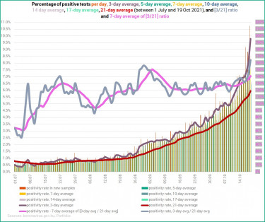
Also note that the test positivity rate exceeded 10% on Tuesday, and the 3-day average percent positive hit 9.78, with 1,668 new cases, 1,058 in hospital, and 145 on ventilator, which compare with an 12.6% positivity rate, 989 new cases, 1,960 hospitalised Covid patients, with 197 of them on ventilator a year ago.
When this ’wave’ started, there was a delay of 10 to 12 days, but it is already down to about four to five days. Coronavirus is clearly spreading at an accelerating rate in Hungary.

The four charts below show the absolute number of COVID-19 patients in hospitals and on ventilators (top two) as well as two ratios (COVID-19 cases in hospital / Active cases, and COVID-19 cases on ventilator / Cases in hospital, bottom two.) The left-hand charts depict a longer period (15 June - 19 Oct), while the right-hand ones show changes over a shorter period (25 July - 19 Oct). 25 July was chosen as the starting point for it was when Covid hospitalisations hit their lowest.
The ascending trend is clear as regards the number of people in hospital and on ventilator. In terms of the number of patients in hospital we are back at early summer levels, i.e. where we were at the end of the previous ‘wave’, whereas there are a lot more people on ventilator than at that time.
Overall, those that are in hospital are in a worse condition, which is attested by the fact that their number has been rising a lot more sharply than it decreased before and the steepness of this particular curve is greater than that of hospitalisations.

The charts below show a sharp rise in the ratio of hospitalised Covid patients to the number of active cases, which came to pass because (i) there are more people with Covid in hospital, and (ii) with the current testing practices the number of active cases is not to be taken too seriously. Underdetection is massive; only the outcome is exactly the opposite of what could have been the original goal (i.e. to mask the severity of the pandemic.)
As for the ratio of those on ventilator to those hospitalised, the 3-day averages have been showing stagnation around 15% for the most part of October. There was a spike at the end of the ‘third wave’ when only those remained in hospital who were in critical condition but then they died and dropped out of this set of statistics. Then the ‘fourth wave’ started where only those in serious condition were admitted in hospitals, hence the steady value of around 15%. The improvement the charts below show is because of the constantly rising number of hospitalised Covid patients and a slower rise in the number of ventilated patients.

You can compare the current situation with the one a year ago by examining the chart below. The three-day average of COVID-19 patients in hospital was 1,960 a year ago which compares wtih 999 currently, whereas the respective 3-day averages of the number of coronavirus patients on ventilator are 188 and 132. This means that there are half as many people in hospital than a year ago (due to vaccines and a possible cross-immunity there should not be that many either), yet only 30% fewer patients need mechanical ventilation.

The pair of charts below are entirely different although they both depict how the changes change. Here’s what you need to know about them.
On the left-hand chart the 0% line is important. When the curves are under 0% there’s a decline, when they go over 0% it’s an increase. The changes show that the situation in terms of hospitalisations started to worsen after 20 August.
More importantly, when a value is north of 0% but the curve descends, it means an increase at a slowing rate, rather than a decrease. If the curve is above 0% and ascending, it is an increase at an accelerating rate. When we are under 0% and the curve goes lower, it translates into an accelerating decrease, and when it goes up it marks a decelerating decrease.

Here are some of the 'usual' charts showing the current 'wave' in the coronavirus pandemic.


The number of new confirmed daily COVID-19 cases is lower than a year ago but the key metric in the current 'wave' is the number of patients in hospital on ventilator, which figures, especially the ratio of ventilated patients to those hospitalised, are far less reassuring.

The current 'wave' was more deadly in August and in the better part of September, but in terms of Covid deaths accumulated since 1 August (to 19 October), we are better off now than a year ago.

And here's the 'balance' of new cases, their accumulation, and Covid fatalities and their accumulation for October (1-19) alone, compared with the same period of 2020.

Number of patients in hospital, days spent in hospital
The left-hand chart depicts the accumulated number of confirmed daily COVID-19 cases and days spent in hospital by coronavirus patients. The accumulated number of new cases in the period under review is about half what we had a year ago. Up until 22 September, those admitted in hospital stayed there longer than in the base period, but then the trend changed.
The number of accumulated cases (between 28 August and 19 October) is about 38% (27,000) of what we had last year (cc. 43,250), yet the number of days spent in hospital is only 31% lower.
The conclusion is that only those infected people are detected and included in the statistics that seek help due to their severe symptoms.
On the right-hand chart you find that the both curves (accumulated number of new cases) keep more or less parallel with the columns, only the 'wrong' columns. The columns show the accumulated number of days COVID-19 patients spent on ventilator (much more this year) but what the relation between the curves and the columns tell us is that there should be way more cases and a lot more hospitalised patients for this kind of overall severity of cases. The gap, however, is about half of what it was about a week ago in terms of the days spent in ICUs.

Ratio of COVID-19 patients on ventilator to those in hospital
As regards the two charts below, the percentage of ventilated COVID-19 patients relative to the number of patients hospitalised (7-day averages) has been rising in the period under review in 2021 (from end-Aug to mid-Sept), while it was dropping in the base period. The gap, however, was closing in the second half of September and it has been closing lately again as the curve started to flatten this year and the ratio began to worsen a year ago.
Previously, the gap was widening most likely because last year even those with mild coronavirus symptoms were admitted to hospital, while these days only those are hospitalised that are in severe/critical condition, hence the higher number (and ratio) of them ending up on ventilator.

Patients in hospital, on ventilator, days spent in hospital and on ventilator
The left-hand chart depicts the number of coronavirus patients in hospital and on ventilator (3-day averages) between 18 July and 19 October, both in 2020 and 2021. The right-hand chart shows the accumulated number of days spent in hospital and on ventilator by COVID-19 patients, also between 18 July and 19 October in 2020 and 2021.
On the left-hand chart we can see that the number of COVID-19 patients in hospital was largely the same in 2020 and this year up until mid-September. Thanks to vaccination coverage the number this year should not have been even half of what we had last year, especially if cross-immunity gained earlier (in the previous waves or epidemics) work.
The numbers (green columns and green area with yellow curve) basically overlapped until mid-September, and they were the closest (644 vs. 595) 14 days ago. Since then the gap has been widening and exceeded 800 by Sunday: 1,856 COVID-19 patients in hospital on 19 October 2020 compared with 988 this year (3-day averages). That was the 'good news'. The not so good news is that the 3-day average of Covid patients on ventilator is not that different than a year ago (138 vs. 188 last year). However, we must note that this marks an improvement as in the period under review, the base period's figure was higher for the first time nine days ago (110 vs. 107) and the difference has just got bigger. However, the difference dropped again yesterday which could be the start of a worsening trend.
On the right-hand chart, the ratio of days spent in hospital to the accumulated number of COVID-19 cases is 90.2% (pinkish columns), while it was less than 81% last year (green area). The conclusion is the same. More coronavirus patients should be in hospital to match this ratio, and there are still a lot more than what the number of cases would warrant.
The number of days spent on ventilator relative to the accumulated number of new cases was 6.8% last year (green curve), while it is 12.6% this year (red curve).
What we see is the piling up of various factors: (i) underdetection, (ii) fewer people in hospital than there should be, (iii) patients hospitalised in more serious condition.

Accumulated number of COVID-19 cases and fatalities, days spent in hospital and on ventilator
On the left-hand chart, the green curve shows the accumulation of new cases in 2020 (in the period under review) which was correlating more with the black columns, i.e. the accumulated number of COVID-19 deaths in 2021, because the number of detected cases was half this year than in the base period (green and the red curves). The ratio currently is about 38%. By now the red curve has almost 'caught up' with the black columns. As mentioned above, there was a delay of 10 to 12 days when this ’wave’ started, but it is already down to about four to five days.
This wave / epidemic was deadlier than it was in the same period a year ago until mid-September, but, as the columns attest, the situation has improved in this respect since then. Not that this many Covid fatalities were acceptable, only the second wave was more devastating in this particular comparison.
On the right-hand chart you see (although you have to look really closely) that the accumulated number of days coronavirus patients spent in hospital this year was higher than in 2020 in the period under review up until 22 September (orange columns are higher than the light blue columns), while the number of days spent in ICUs (red and green curves) is only about 15% higher currently than a year ago, down sharply from around 120% in mid-September. The gap has been narrowing since 8 October, but not because the situation has started to improve. The sharp increase is undeniable, only the situation worsened at an even greater pace a year ago.

Vaccination concerns
Given that vaccinations have practically stalled at a vaccination coverage of about 60%, and the cabinet has no intention to openly tighten anti-pandemic measures (although some cautious steps have been taken in this direction), we see no reason why the epidemiological situation should improve in the immediate future. There is a much greater chance that the numbers will keep worsening for a while.